
// Logo Design // Brand Identity // Marketing Collateral
// Illustrator // InDesign
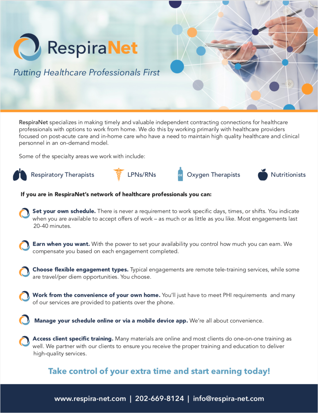
RespiraNet is a staffing agency that creates a network for respiratory healthcare professionals and healthcare providers to connect. The company was just beginning and needed a brand identity that showcased the connection between all three partie
The trademark design features three elements that interact with one another to hint at the strong network RespiraNet is building between RespiraNet, healthcare professionals, and healthcare providers. The blues represent air for the specialization in respiratory care while the orange creates a pop of color, places emphasis on the shortened word for network, and speaks to the healthcare industry.
RespiraNet has an online portal for healthcare providers to connect with respiratory therapists. The hero image showcases a doctor searching on a mobile device and the web of interconnected dots shows the link amongst the network — each represented by a color from the logo.
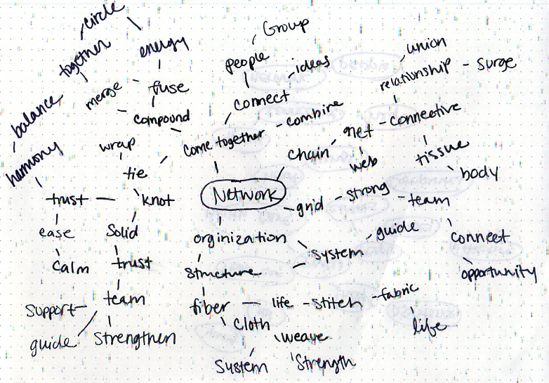
Initial mind map exploring "network" as the key word to focus the logo on.
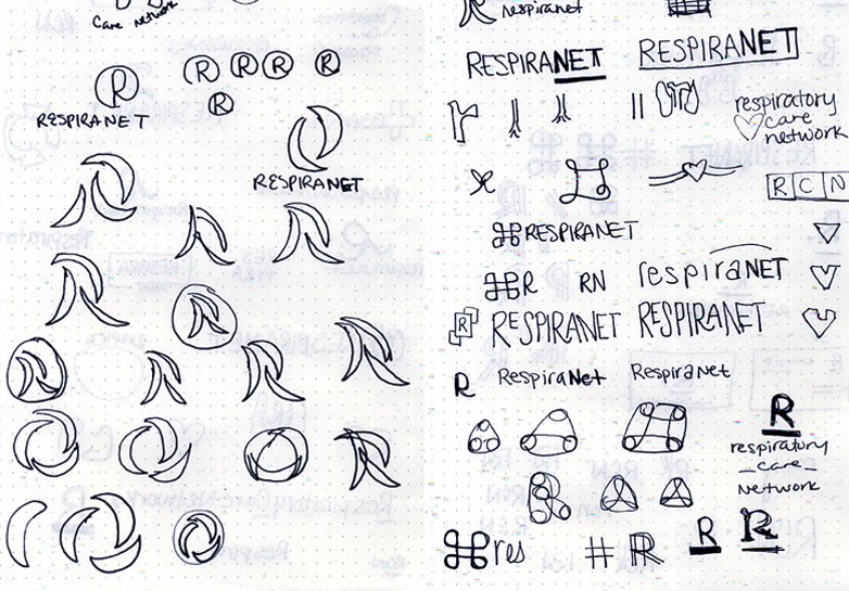
A couple pages of initial concepts for the RespiraNet mark.

Marketing collateral for healthcare providers
Marketing collateral for healthcare professionals