// Branding // Web Design // Print Design
// Illustrator // InDesign // HTML // CSS // HubSpot
ASI hosts an annual conference for its growing reseller and partner network called The ASI Reseller Conference (ARC). ASI has been hosting this conference for 16 years but has never had any consistent branding that tied the conferences together and supported the corporate identity to make it a meeting that attendees and sponsors could recognize on its own. As the conference continues to grow, it was important that this conference start to have a more standardized, but flexible, look and feel.
Past meeting websites and collateral relied solely on images depicting the location of the conference. In addition, inefficiencies such as four separate websites were being created every year — one desktop and one mobile version for resellers and the same for sponsors.
I reduced the number of websites to one reseller site and one sponsor site by designing and creating responsive sites. I then created a pattern and layout that worked as a branding statement specific to the annual conference with enough flexibility that it could be altered each year to create a fresh feel. The pattern stems from the lettering of the ‘A’ in the ASI logo and, for 2017, the gradient applied to the pattern hinted to the blue and green in ASI’s corporate colors for their product logos.
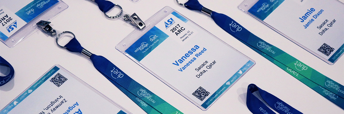
I applied the elements to all aspects of the conference including session posters, directional signage, name badges, lanyards, agendas, bags, PowerPoint presentations, websites, stages and podiums. This brought everything together and created a cohesive conference experience for attendees.